

Journal VIII | October 18, 2017
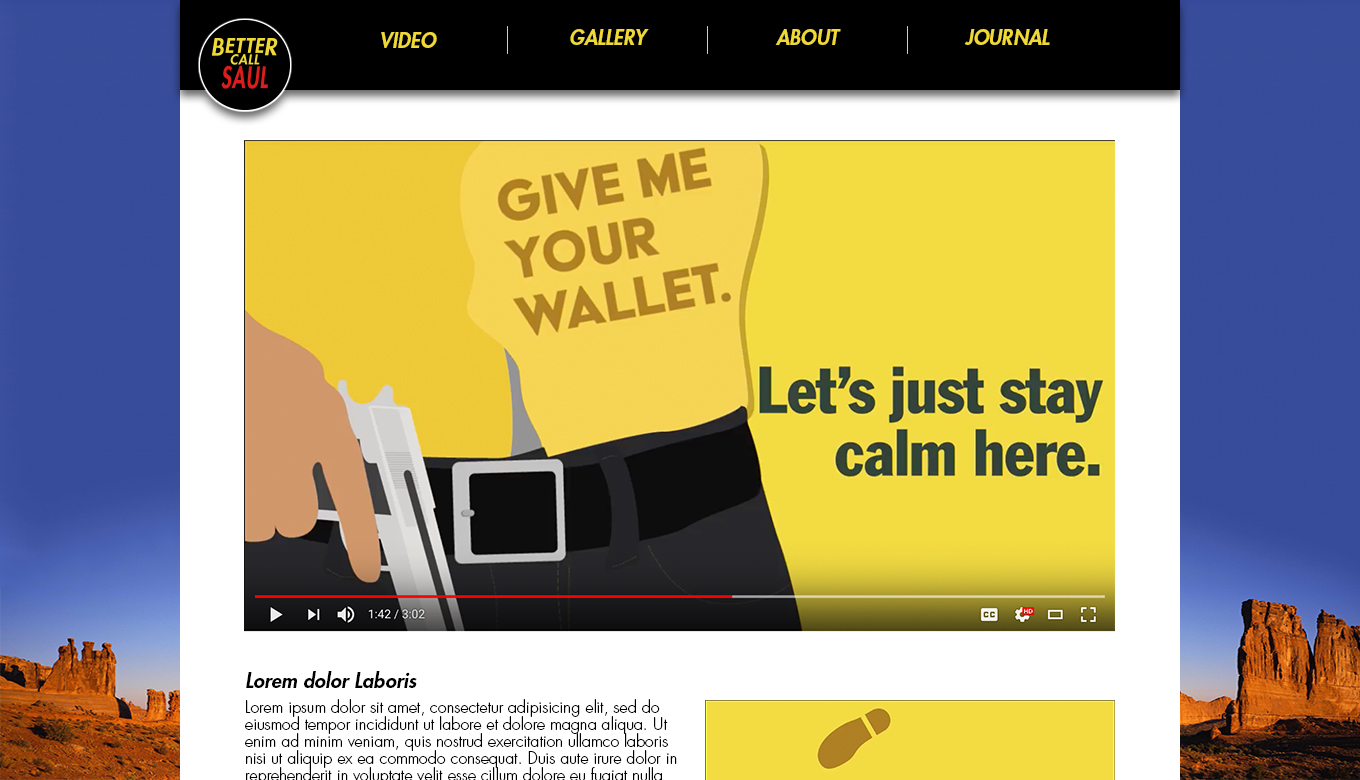
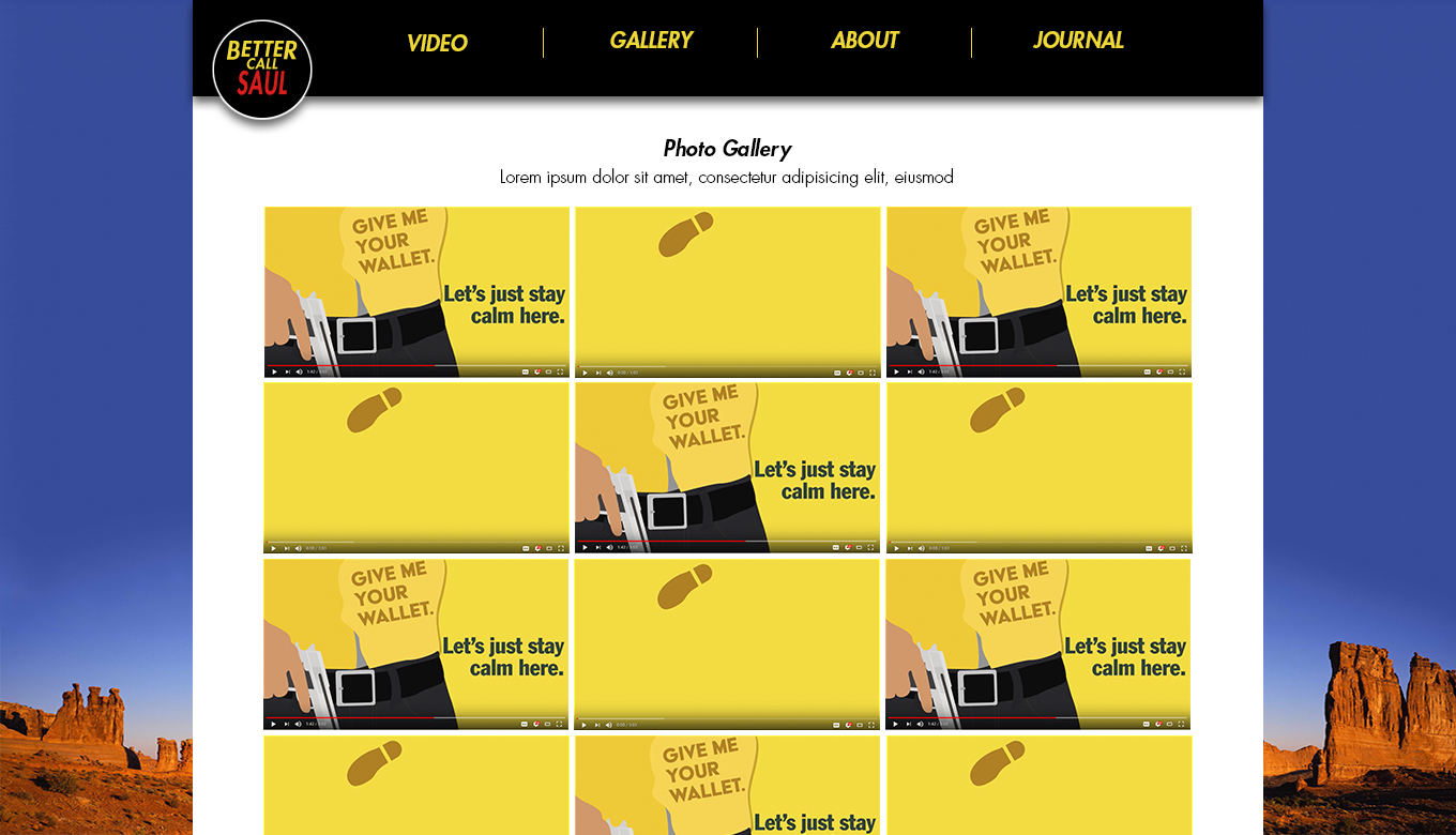
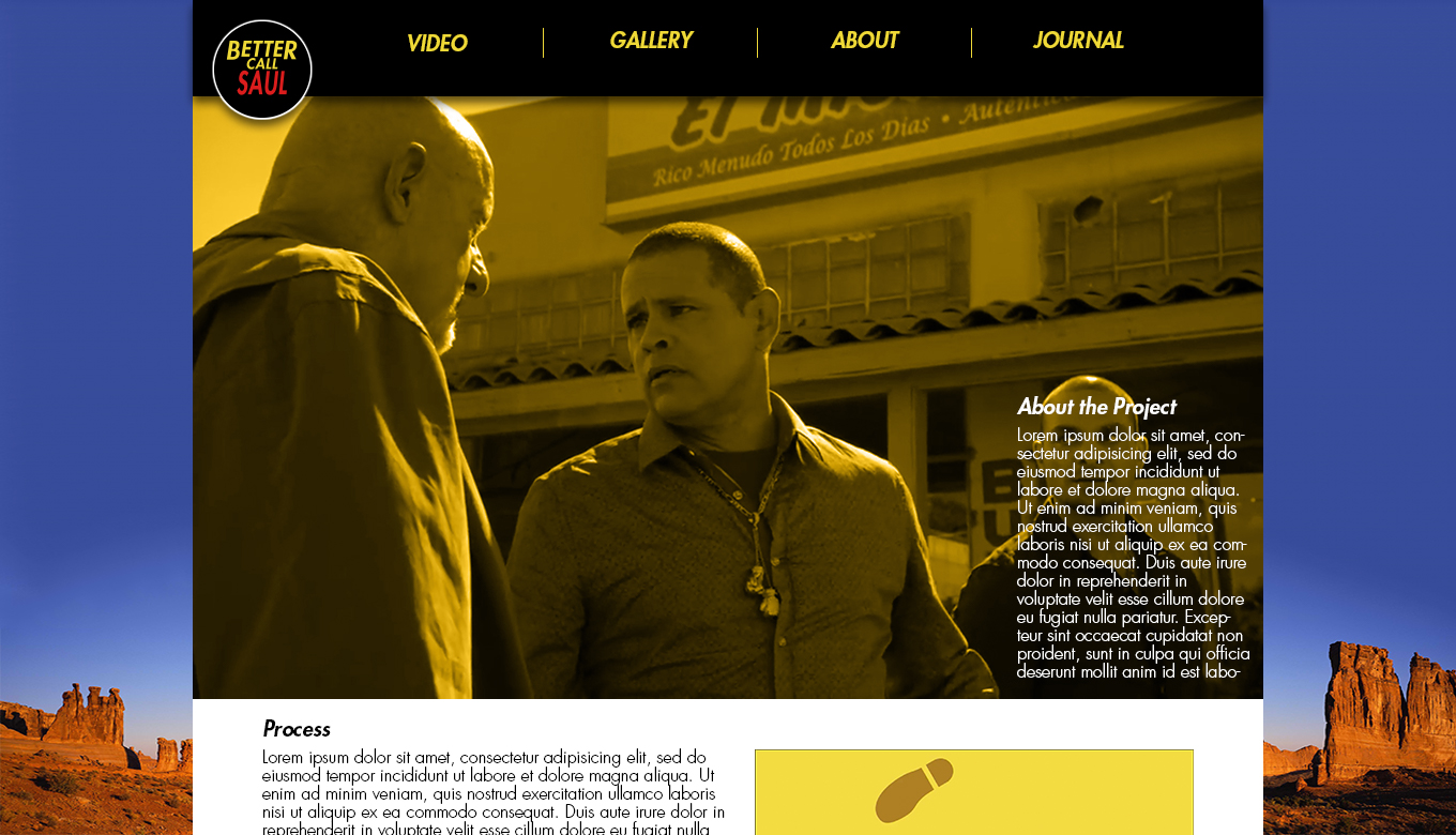
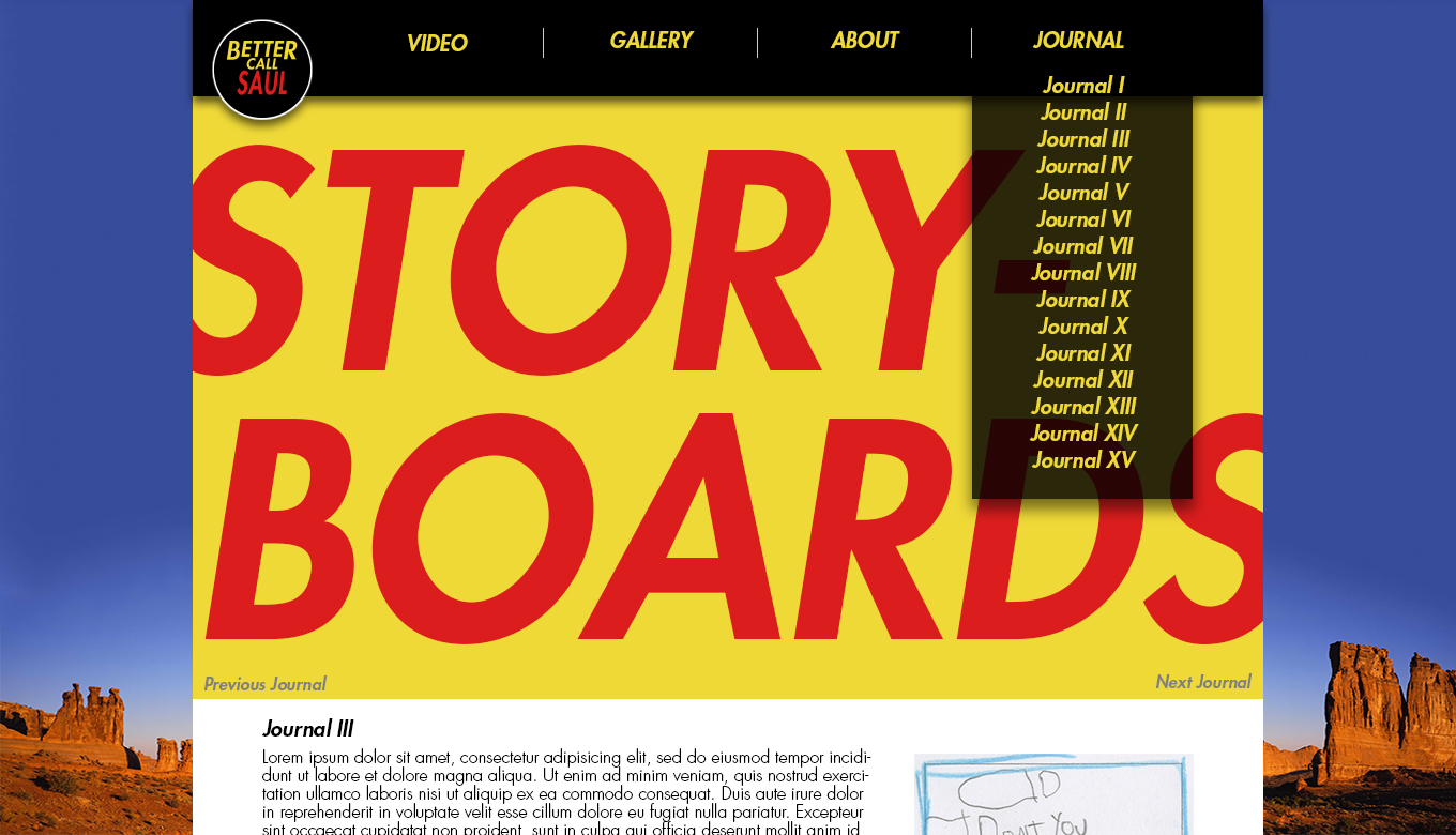
The biggest of the critisms with my first draft of the website mockup had to do with the header. Mainly, to move Journal into the header, which was an easy fix and a misunderstanding on my part in the first place. The other was the length of the words and arrangement of sections in the header. One friend told me to move About to the end, but I felt like Journal should be at the end, since that is kind of it's own thing, but About is still a part of the video project.
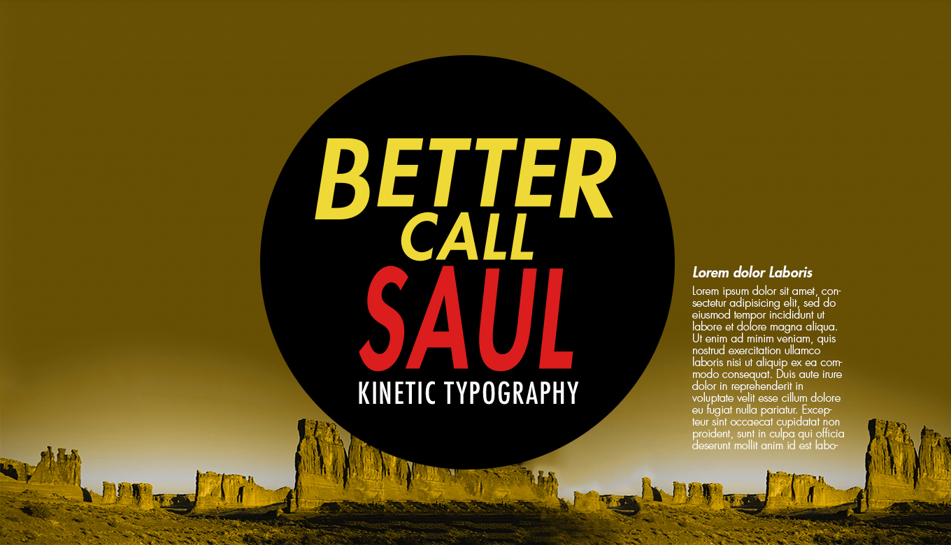
Another thing I changed was the type in the header logo. Another friend said to do this. I got rid of the small text, and on the splash page, I changed it from "Typography Project" to "Kinetic Typography." One thing with the type I may have to change is the typeface, as I don't believe Futura is a websafe font. I'm going to explore some new options but I have one in mind, called "Nunito". The only reason I do not have it in now is because while I can use it on the web through Google Fonts, I myself do not have it on my computer, and cannot use it in Photoshop.
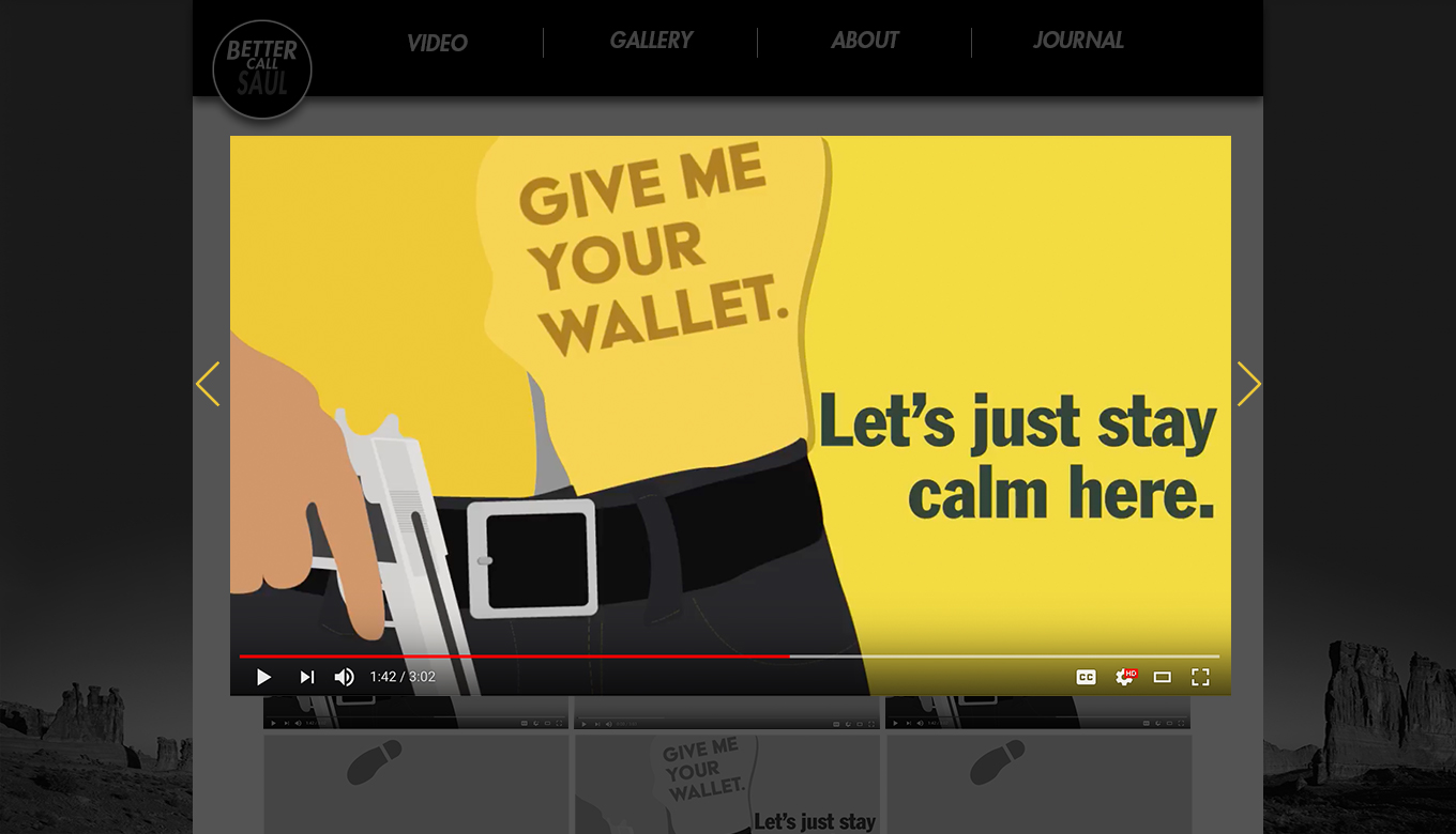
Other that that, people really liked my website. Two main things that people liked was my use of color, and the shadow under the header.
Here are links to my pages. They all link to the same Photoshop File.